Block Diagram
Last updated:
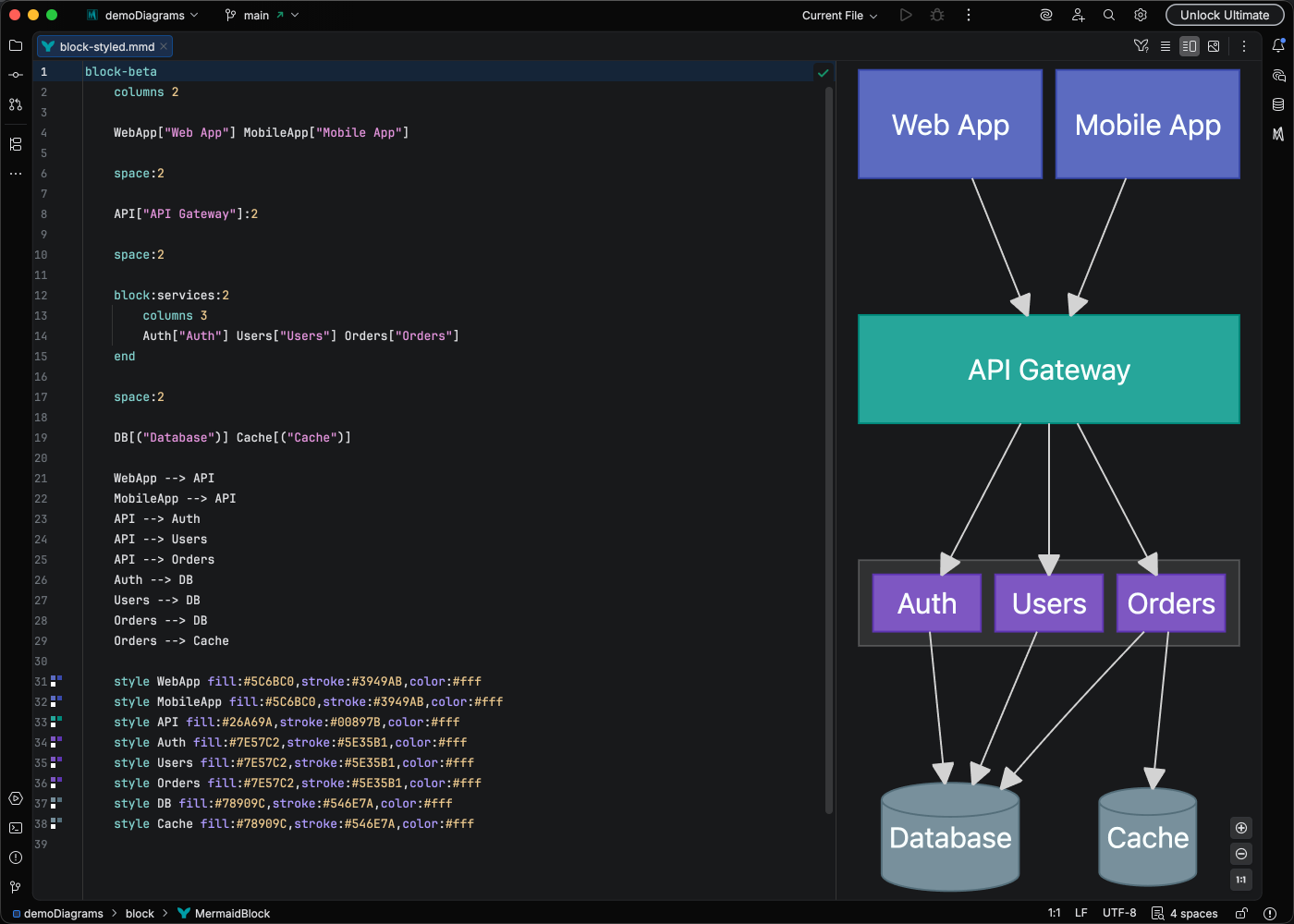
Block diagrams provide a structured way to visualize system components and their relationships using a column-based layout. They are ideal for system architecture overviews, component diagrams, and high-level technical documentation.
Syntax Highlighting
Section titled “Syntax Highlighting”Syntax highlighting integrates directly with IntelliJ’s color scheme system, so diagram colors always match your editor theme.
IDE Support
Section titled “IDE Support”Mermaid Studio provides comprehensive support for block diagrams:
- Syntax highlighting for blocks, columns, connections, and CSS properties
- Code completion for block types, arrow operators, CSS properties and values, class names, node references, and column keywords
- Rename refactoring to safely rename block identifiers, CSS class names, and node references across your entire diagram
- Find usages to locate all references to a block or CSS class
- Go-to-definition to navigate from class and style references to their definitions
- Code folding to collapse composite blocks
- Formatting with configurable code style settings for indentation, spacing, and wrapping
- Inspections for duplicate nodes, duplicate class definitions, unresolved class references, unused classes, and invalid composite block shapes
- Annotations for undeclared nodes, zero-width blocks, invalid arrow syntax, empty composite blocks, unclosed blocks, and more
- Brace matching for all shape delimiters and composite block boundaries
- Code Vision showing usage counts for CSS class definitions
- Color provider with gutter color swatches and a color picker for hex colors in
classDefandstylestatements - Navigation bar for quick access to diagram elements
- Structure view for a hierarchical overview of the diagram
- Quick fixes for splitting edge chains, quoting edge labels, and converting Markdown strings
- Auto-indent inside composite blocks - pressing Enter after a block header automatically inserts proper indentation and a closing
end
Quick Syntax Reference
Section titled “Quick Syntax Reference”Layout
Section titled “Layout”block-beta columns 3
A["Service A"] B["Service B"] C["Service C"]
%% Span multiple columns D["Wide Block"]:2 spacecolumns N- Set the number of columns (orcolumns auto)id:N- Make a block span N columnsspaceorspace:N- Insert empty cells for spacing
Node Shapes
Section titled “Node Shapes”| Syntax | Shape |
|---|---|
id["Label"] | Rectangle |
id("Label") | Rounded rectangle |
id(("Label")) | Circle |
id((("Label"))) | Double circle |
id{"Label"} | Diamond |
id{{"Label"}} | Hexagon |
id(["Label"]) | Stadium/pill |
id[["Label"]] | Subroutine |
id[("Label")] | Cylinder |
id[/"Label"/] | Lean right |
id[\"Label"\] | Lean left |
id[/"Label"\] | Trapezoid |
id[\"Label"/] | Inverted trapezoid |
id>"Label"] | Arrow rectangle |
id<["Label"]>(right, down) | Block arrow |
Connections
Section titled “Connections”| Syntax | Description |
|---|---|
--> | Arrow |
--- | Line (no arrowhead) |
--"label"--> | Arrow with label |
<--> | Bidirectional arrow |
-.-> | Dotted arrow |
--o | Circle endpoint |
--x | Cross endpoint |
---> | Long arrow |
Composite Blocks
Section titled “Composite Blocks”Composite blocks group nested blocks together with their own layout:
block-beta columns 2 block:group1["Backend"]:2 columns 2 api["API"] db[("Database")] end frontend["Frontend"] cache["Cache"] frontend --> api api --> dbStyling
Section titled “Styling”block-beta columns 2
A["Primary"] B["Secondary"]
%% Define CSS classes classDef primary fill:#4CAF50,color:#fff,stroke:#388E3C classDef secondary fill:#2196F3,color:#fff
%% Apply classes class A primary class B secondary
%% Inline style style A stroke-width:2pxclassDef name properties- Define a reusable CSS classclassDef default properties- Set default styling for all blocksclass id1,id2 className- Apply a class to one or more blocksstyle id properties- Apply inline CSS to a specific block
For complete syntax details, see the Mermaid Block Diagram documentation.