
Theme Editor
Last updated:
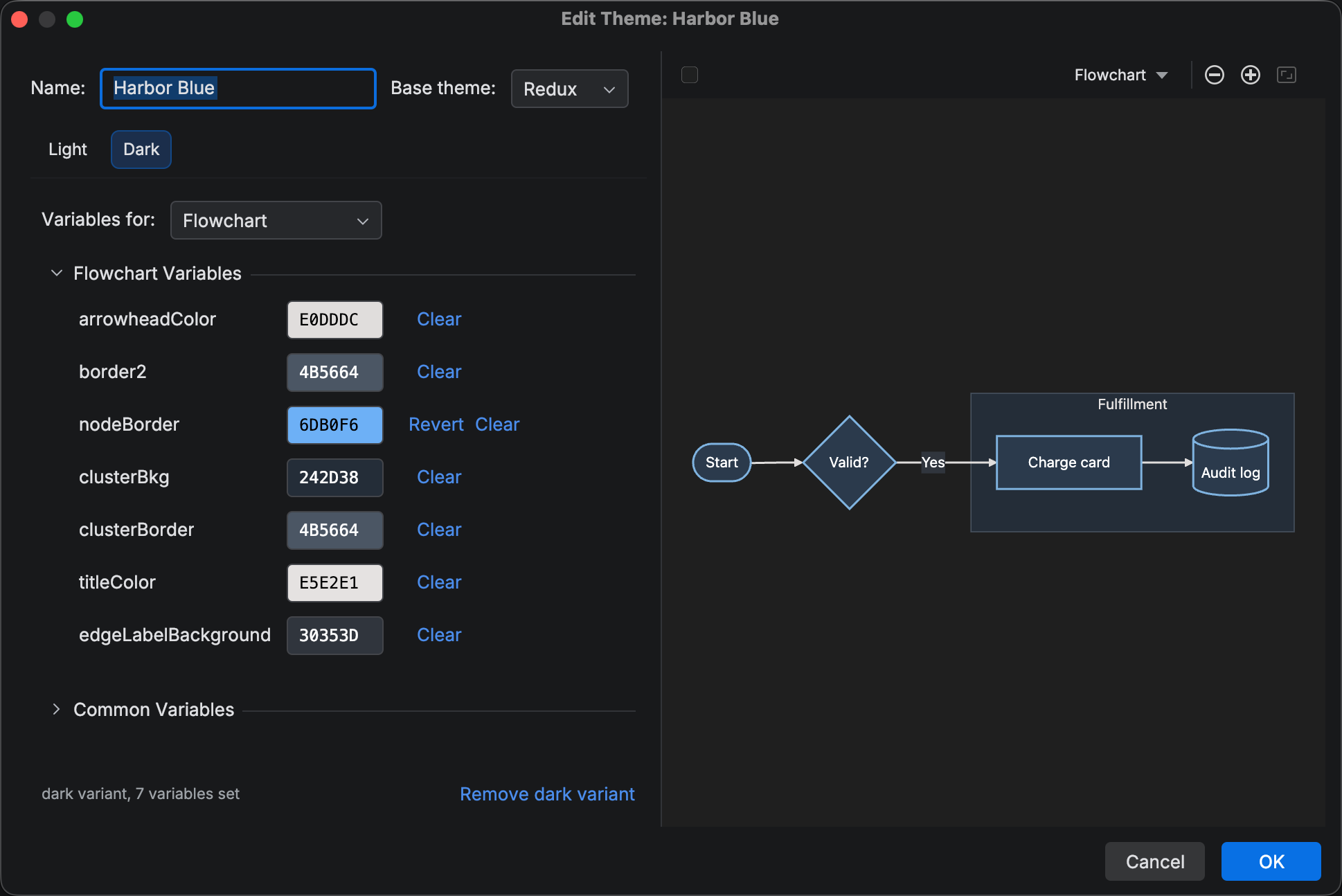
In the Theme Editor you adjust a theme one variable at a time, with a live preview beside the form. Open it by editing a custom theme on the Custom Themes settings page, duplicating a bundled one, or choosing Create and Refine… in the Theme Generator.
If a theme is missing a light or dark variant, you can add it here.
Variables
Section titled “Variables”Scope the form with the Variables for combo at the top of each variant. All diagram types shows the common variables. Switching to a specific diagram type allows you to set the colors for that particular diagram type, both its unique theme variables as well as overriding the theme’s common variables for that specific diagram.
Adding or removing a variant
Section titled “Adding or removing a variant”If a theme is missing a variant, the variant’s tab in the theme editor will display a Create Light Variant or Create Dark Variant button with three options.
- Generate from seed colors — derives the variant from the seeds stored with the theme; available for themes the Theme Generator created.
- Start empty — an empty variant allows you to manually build a theme variant from scratch.
- Copy from light variant / Copy from dark variant — duplicates the other variant as a starting point.
A Remove light variant / Remove dark variant link at the bottom of a defined variant removes it. The link appears only while the other variant exists, since a theme needs at least one.
Live preview
Section titled “Live preview”The preview renders one of the plugin’s bundled sample diagrams with the theme as it stands, updating as you edit. The sample follows the Variables for selection, so picking Sequence shows a sequence diagram, and All diagram types shows a flowchart.
Its toolbar has a Look button that cycles Classic, Hand Drawn, and Neo, so you can check your colors in each look.
HCT color picker
Section titled “HCT color picker”Every color control in the Theme Editor, the Theme Generator, and the Style Pane opens a color picker built from the ground up around the HCT color space. HCT separates hue, chroma (colorfulness), and tone (perceived lightness, 0 to 100). Dragging Tone lightens or darkens a color without changing what color it reads as, so you can tune contrast without losing the hue you chose.
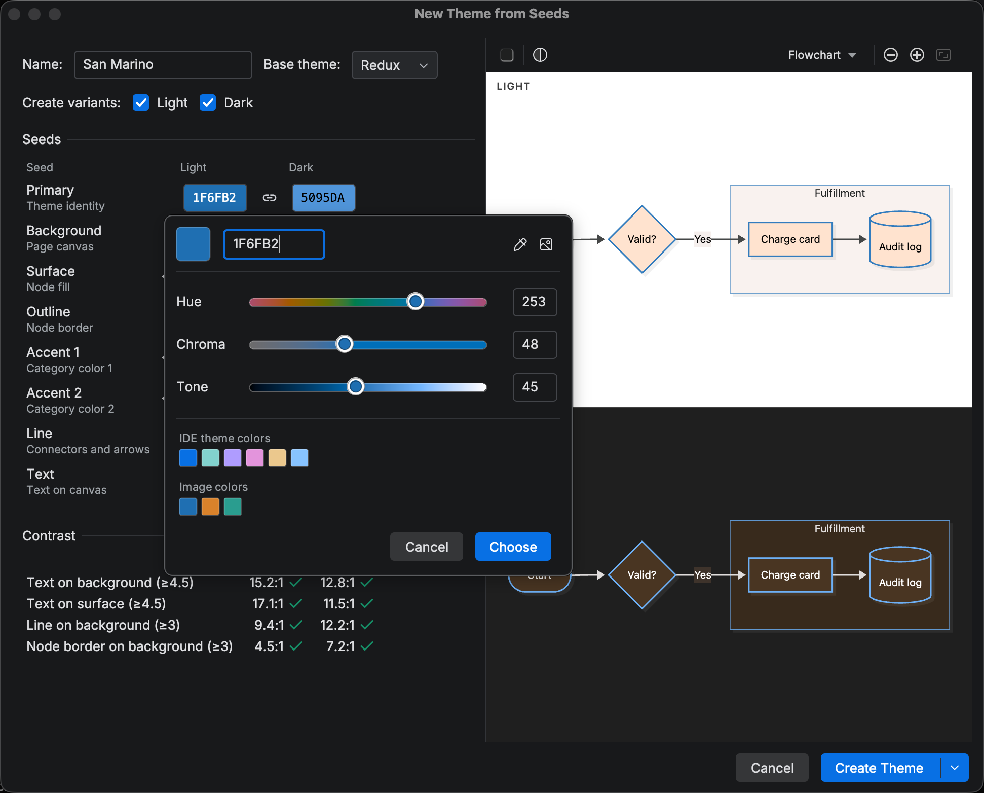
The picker contains, top to bottom:
- A Hex field next to the resolved swatch. Values apply as you type;
Enter Enter Enter Enter commits and closes the popup. - Hue, Chroma, and Tone sliders, each with a numeric field. The tracks repaint as the other values change, so the Hue track shows each hue at the current chroma and tone.
Enter Enter Enter Enter in a numeric field applies without closing. - Suggestion groups of small swatches (e.g., recent colors, image colors). Clicking one of these swatches updates the selected color.
The picker’s header contains two additional actions:
Pick Color from Screen allows you to pick a color from the screen (unavailable in Linux environments using Wayland). Add Image (theme dialogs only) chooses an image file and adds an Image colors group with up to eight colors extracted from its contents.
Related
Section titled “Related”- Custom Themes overview — bundled custom themes, applying, and settings
- Theme Generator — start from seeds or an image
- Theme CSS — CSS for effects beyond theme variables, such as animations