
What's new in Mermaid Studio 2026.4.0?
Last updated:
Mermaid Studio 2026.4 delivers a new set of diagram styling capabilities, focusing on custom themes and theme-derived element presets for the style pane.
This version ships with a new seed-based theme generator that can generate beautiful light and dark themes for nearly all Mermaid.js diagrams from a single seed color. Go further and fine-tune a theme’s look for a single diagram type with the new custom theme editor.
Additionally, it comes with eight bundled custom themes with light and dark variants that are free to use by all Mermaid Studio users.
This release also improves keyboard navigation and accessibility across a number of surfaces with the most prominent being the appearance menu and element style pane.
Highlights
Section titled “Highlights”Bundled custom themes
Section titled “Bundled custom themes”Eight bundled custom themes can be applied to diagrams by all users. Pick one from the Custom theme section of the preview’s Appearance menu, or from the new Switch Diagram Theme action described below. Each one has a light and a dark variant that can be toggled using the Light/Dark toggle.
Bundled custom themes render on Mermaid.js’s redux built-in theme by default.
The Base theme for bundled themes setting on the Custom Themes settings page can switch the whole bundled themes library to the plain base theme instead; redux requires Mermaid.js 11.14.0 or later and steps down to base on older pinned runtimes.
If you’d prefer to stick to the built-in Mermaid.js themes, you can also hide custom themes from the appearance menu. See the Custom Themes overview for more details.
Theme Generator
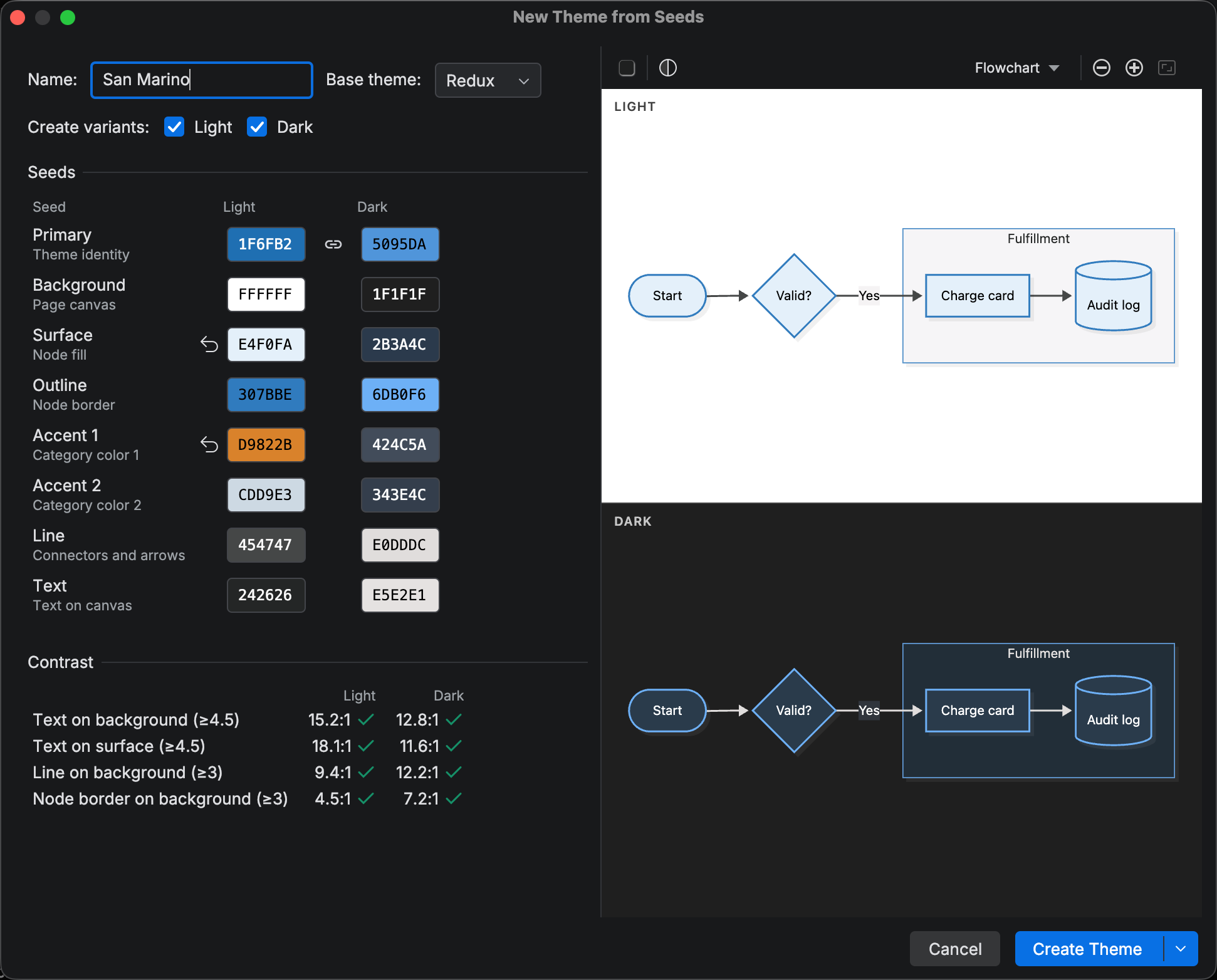
Section titled “Theme Generator”Creating a theme starts in the Theme Generator. You pick a primary seed color and the generator derives complete light and dark themes instantly. Customize any of the seven optional seed colors to create a more complex theme.
Light and dark variants can share seeds or be adjusted independently to fine-tune their looks to your taste.
As you adjust the seeds, a dual live preview shows both variants, so you can see exactly how your changes impact the generated theme. Switch between looks or diagram types in the previewer to see how the generated theme looks for the diagrams you care about. Use the provided contrast checker to ensure text, lines, and borders are readable.
Seeds can also come from a picture. New Theme from Image… in the settings page’s Add dropdown scans a logo or screenshot for its dominant colors and fills the primary and accent seeds for you. The plugin names the theme after the primary color until you type your own name.
Create Theme stores the result and stops there; Create and Refine… stores it and opens the theme editor so you can fine-tune individual variables. The brand theme guide walks through the whole flow from an image to a diagram rendered on GitHub.
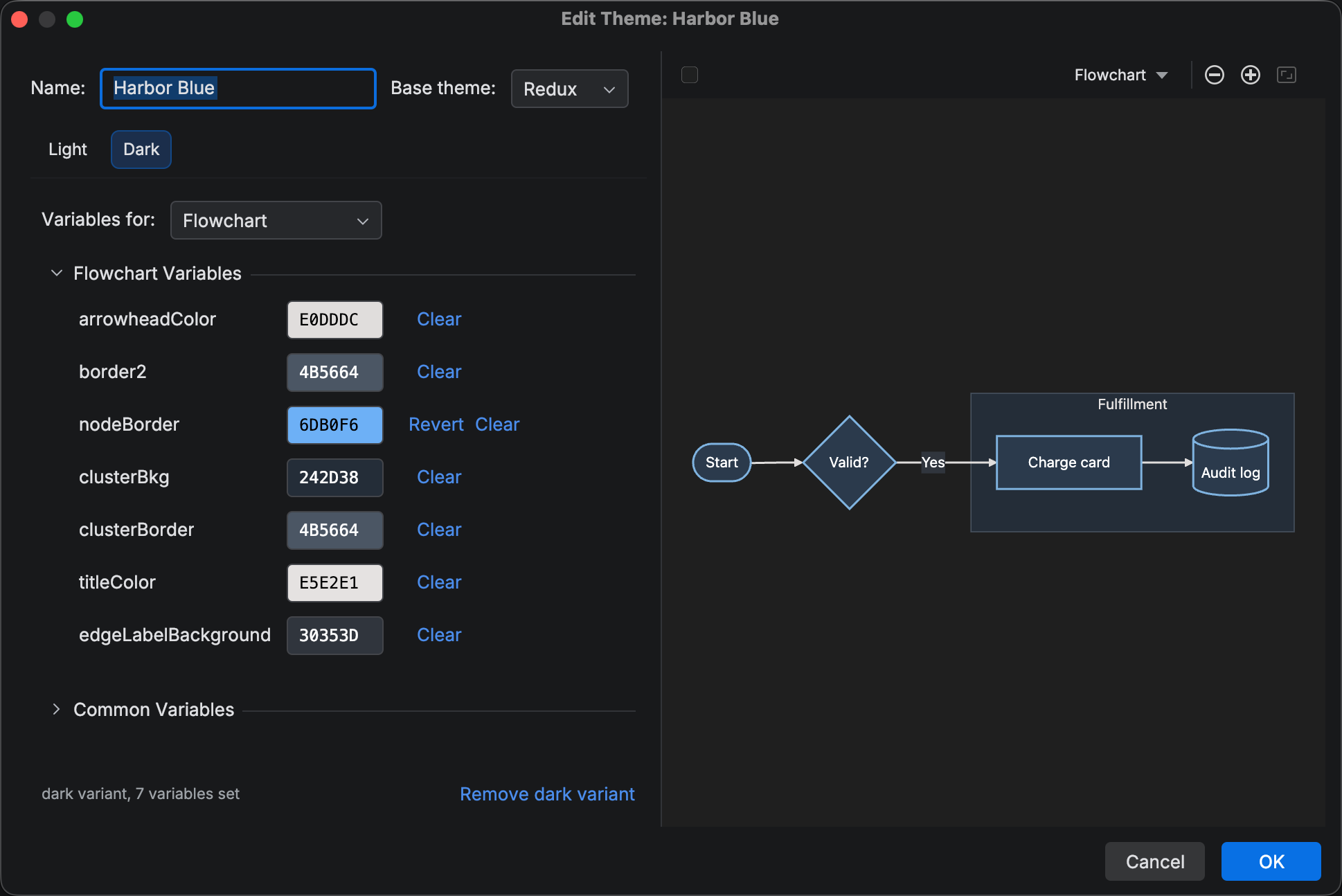
Theme editor
Section titled “Theme editor”The theme editor edits one theme variable at a time. Use the scope selector to switch between the common variables and the variables associated with a particular diagram.
Custom themes cover all supported diagram types except C4, which is in the midst of a modernization initiative in the Mermaid.js project.
How custom themes are applied
Section titled “How custom themes are applied”Mermaid.js has no native support for custom themes, so applying a custom theme means writing all the relevant theme variables to the diagram’s frontmatter. Mermaid Studio knows which variables are relevant to any particular diagram type and only writes those variables to the diagram’s frontmatter to minimize frontmatter bloat.
The plugin also writes an x-mermaid-studio metadata marker to the diagram’s frontmatter to track the applied custom theme.
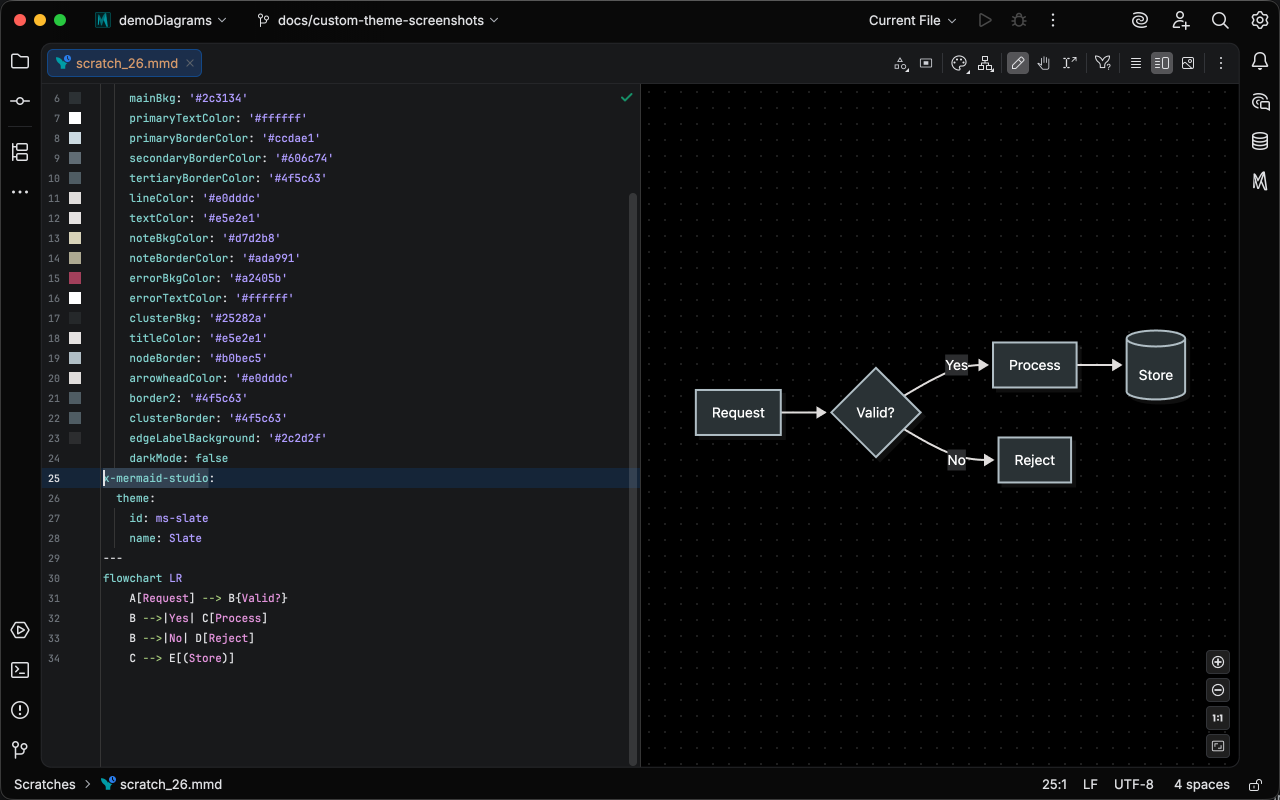
The marker lets the plugin switch the diagram between the theme’s light and dark variants and also powers the element style pane’s derived presets feature.
Picking Auto or any built-in theme in the Appearance menu removes the marker and clears the custom theme from the diagram’s frontmatter.
Switch Diagram Theme
Section titled “Switch Diagram Theme”A new Switch Diagram Theme action is now available for quickly switching a diagram’s theme via the context menu in .mmd files as well as mermaid/mmd language code fences in Markdown.
It opens a searchable list of built-in and custom themes with a Light/Dark toggle in its header and applies the pick to the diagram at the caret.
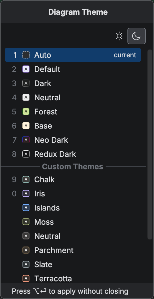
Type to filter the list of themes and quickly find the theme you are looking for.
Theme-derived style presets
Section titled “Theme-derived style presets”The Style pane no longer ships hand-picked preset lists. It derives its presets from the theme the diagram renders with, whether that is a built-in Mermaid.js theme, a bundled custom theme, or one of your own, so every preset fits the diagram’s palette.
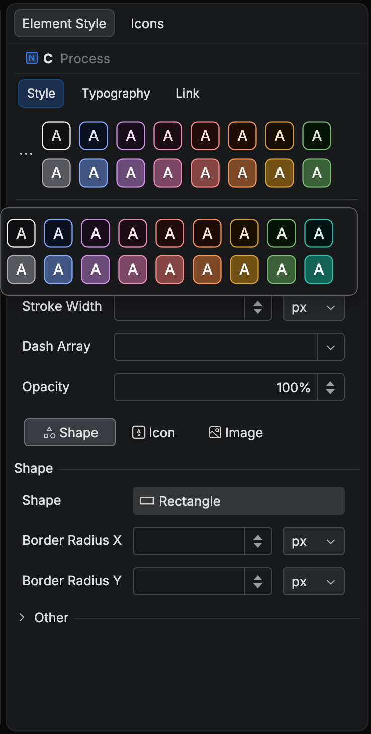
The paged carousel is gone, replaced by two preset rows and an All Presets (...) button that shows the full set of presets available for the current diagram in a filterable popup.
Themes typically get light, mid and dark preset groups, but themes classified as outlined (typically themes with near black or near white surfaces) will instead have outlined and filled preset groups.
HCT color picker
Section titled “HCT color picker”Color swatches in the Style pane and the theme dialogs sport a new color picker built on the HCT color space, with Hue, Chroma, Tone and alpha (where transparency is supported) sliders. The new HCT color picker makes it much easier to adjust colors while maintaining appropriate contrast, and it enables the plugin to offer contextual color suggestions rather than being limited to recents.
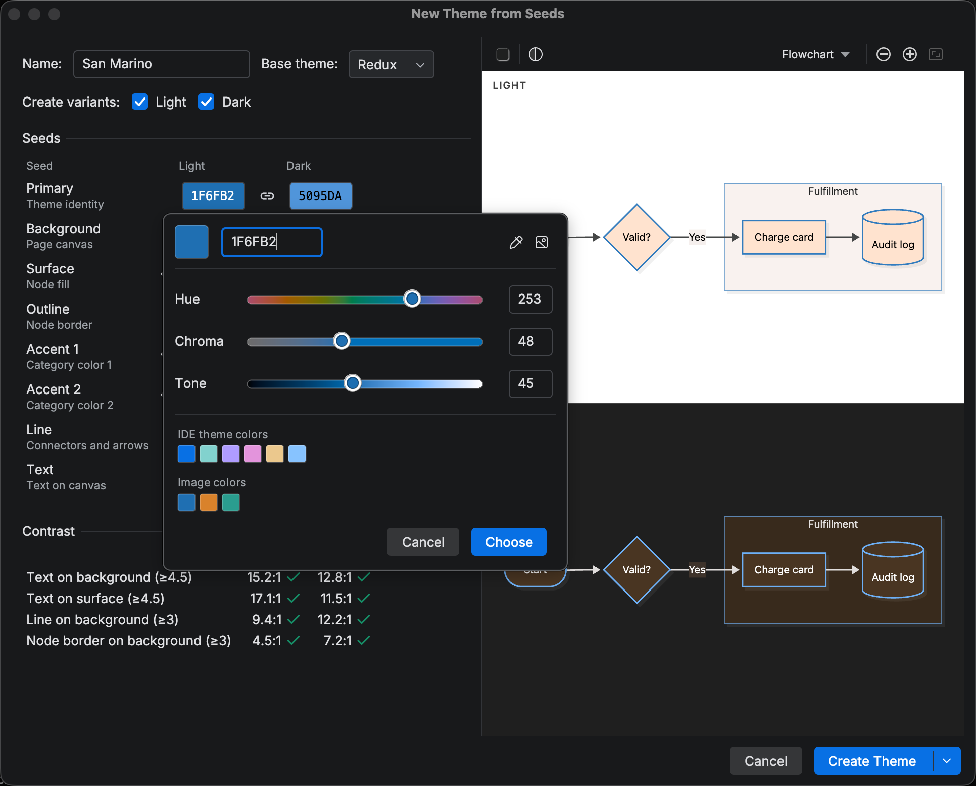
The new color picker includes a pipette tool for choosing a color from a screen pixel (except on Linux systems using Wayland).
In the theme dialogs, Add Image extracts a palette from a picture and offers it as an Image colors group.
Changelog
Section titled “Changelog”- Custom themes: a bundled library of eight diagram themes, plus (paid) your own. Custom Themes settings list, create, edit, duplicate, import, export, and remove themes; the Appearance popup and Switch Diagram Theme context menu action apply them to a file or a Markdown fence, and a tracked marker in the frontmatter keeps the theme’s light and dark variants switchable
- New Theme from Seeds: generate a theme’s light and dark variants from a few seed colors, with a dual live preview and contrast estimates
- New Theme from Image: the Custom Themes page’s Add dropdown can seed a theme from a picture
- Theme editor: create or modify custom themes with the full list of theme variables per diagram type and preview changes instantly
- HCT color picker for theme and Style pane colors: hue, chroma, and tone sliders, a screen pipette, and suggested colors from an image
- Style pane presets derived from the applied theme (Mermaid.js built-in themes or custom themes)
- Switch Diagram Theme action: a searchable theme popup with a Light/Dark toggle that applies a theme to the current file or to the Mermaid code fence at the caret in Markdown
Changed
Section titled “Changed”- Improved keyboard navigation across the Appearance popup, the theme switcher, the Style pane, and the shape and icon pickers
- Appearance popup: Cmd+L / Cmd+D (Ctrl+L / Ctrl+D on Windows and Linux) switch to the Light / Dark variant
- Theme and appearance actions no longer rewrite a diagram whose frontmatter is malformed or unclosed
- Exporting, copying, or printing a Mermaid code fence in Markdown now includes the fence’s own frontmatter (theme and config), which was previously dropped; indented fences also export dedented source
- Runtime config overrides: the overrides editor now offers schema completion and validation in Remote Development, where it previously offered none
- Runtime config overrides: resetting an override from the settings page now refreshes an open overrides editor tab instead of leaving it showing the old YAML
- Appearance popup: the Look header no longer shows Classic for a diagram without a frontmatter look when the config overrides set
look: neo(or the runtime default theme is a redux theme); it now reports the look the preview actually renders - Appearance popup, theme quick-switch, and Match-preview export/print/copy now key on the light/dark default the preview actually renders (the IDE theme under an Auto background, the forced canvas under White/Black); a dark IDE with a White preview background renders and reports the light default
- Match-preview export, print, and copy invoked on a Markdown code fence now bake the light/dark default the fence actually renders with (Markdown previews follow the IDE theme and ignore the standalone preview background setting)
- The popped-out fence preview now shows the fence as it appears inline (IDE-theme appearance, canvas unaffected by the standalone preview background); its runtime config overrides still follow the Preview context
- Export, print, and copy from the popped-out preview’s context menu now resolve the same appearance as its toolbar actions, which previously could bake the opposite light/dark variant under a forced preview background
- Preview toolbar toggles (Edit Mode, Track Caret, Pan, Layout), the sample picker’s Layout menu, and the icon-set, style-pane, and custom-theme toolbar actions are no longer disabled while the IDE is indexing